Putting carers first at every move
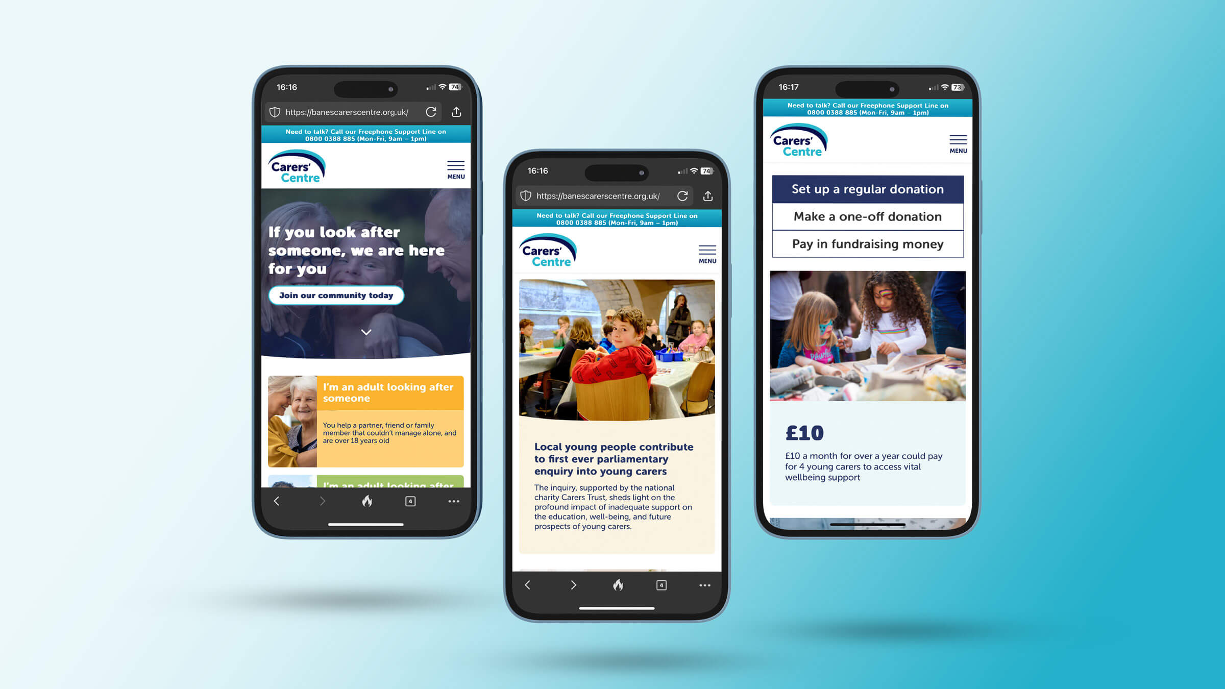
Delivering an engaging and accessible website that delivers for their users

increase in traffic to the site
17hrsof user testing
The brief
BANES Carers Centre are providers of respite services, advice and information for the carers community for the Bath and North East Somerset.
To understand what carers really needed and how digital solutions could meet those needs, we aimed to create an engaging and accessible website that delivered for their users. Our goal was to place carers at the center of every stage of design and development. Additionally, we shared our learnings beyond the people we served by making everything open source and available to every carer or organisation supporting carers.
The solution
As part of a wider digital transformation program, we embarked on a detailed discovery to understand carers’ needs. We conducted multiple user workshops and 1:1 sessions with young carers, adult carers, and the parents of young carers. To ensure their voices were heard and accurately represented, we involved carers directly in the process through participatory workshops.
In addition to open sourcing, we catalogued the journey with BANES on Medium, allowing other organisations to share our learnings.
What we did
We defined detailed user profiles and journeys to establish clear wireframes for the new site, completely revising the previous design. We tested every stage with users to ensure everything was grounded in and led by their feedback, continually iterating based on user insight.
Our user profiling and detailed user journeys fully captured the needs and behaviours of carers, which informed the collaborative design of the website's structure and functionality during wireframe workshops. Furthermore, we translated their existing print branding into a digital format to maintain a cohesive identity.
Leveraging Umbraco and Azure charity credits, we built a robust website infrastructure and seamlessly integrated it into Salesforce, streamlining their operations and enhancing the user experience.
- Umbraco CMS
- Uskinned
- Azure
- Integrated into Campaign Monitor
- Salesforce
- Stripe / GoCardless


The impact
Our comprehensive approach, which included 17 hours of user testing, ensured that the final website perfectly captured the needs of carers. The project delivered a new, integrated, user-led website that elevated strategic priorities and ambitions of the organisation. We successfully:
- Attracted and retained users by providing greater value to members and enabling the website to be a platform for the collective voice carers.
- Increased public awareness of the charity.
- Co-created the website through user research, testing, and feedback, ensuring it considered accessibility and provided an immersive and engaging experience on both mobile and desktop.
- Seamlessly integrated the website into Salesforce to streamline processes and deliver enhanced functionality.
- Built the website on Umbraco Content Management System (CMS).
- Provided full support and continual development through a managed service.
This meticulous process led to a highly effective and user-friendly website that met and exceeded the project's goals.
Related case studies

Bringing Tibetan mediation practices to the people
- User experience

Award-winning UX for commercial success
- User experience

A safe space for young people to unite
- User experience

Putting carers first at every move
- User experience

Transforming a community bank to a fintech with purpose
- Strategy

A digital transformation journey for a South West charity that truly cares
- Strategy

Flying to new fundraising heights
- Strategy

Revolutionising e-learning through gamification
- User experience

Gamifying life-saving skills for youth
- User experience